Ariticle Logos
Many of the logos that were created during my tenure at the Baltimore Ravens were for articles on the Ravens official website and Phone App.
Most of these logos would be used to attract Sponsors to the articles.
Below you will see breakdowns of the logos. Some include original sketches, rough drafts, other logo options, final logos and how they were used on article thumbnails.Ravens Eye View
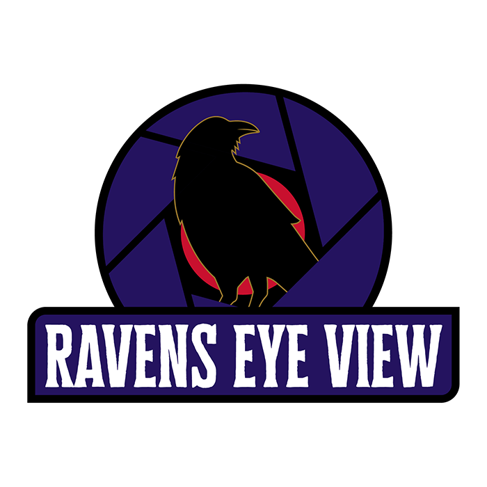
Ravens Eye View is an article on the Baltimore Ravens website which
highlights film breakdowns and photos of big plays by players on the Ravens roster.
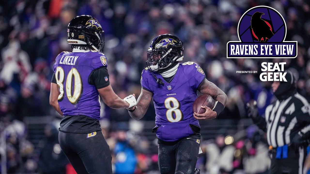
The logo features a raven standing in the middle of a camera shutter/iris. The red dot in the center is both the camera iris and used to indicate the camera is rolling. This is a nod to the photo and video aspects to these articles.
Final Approved Logo
Article Thumbnail
Transactions
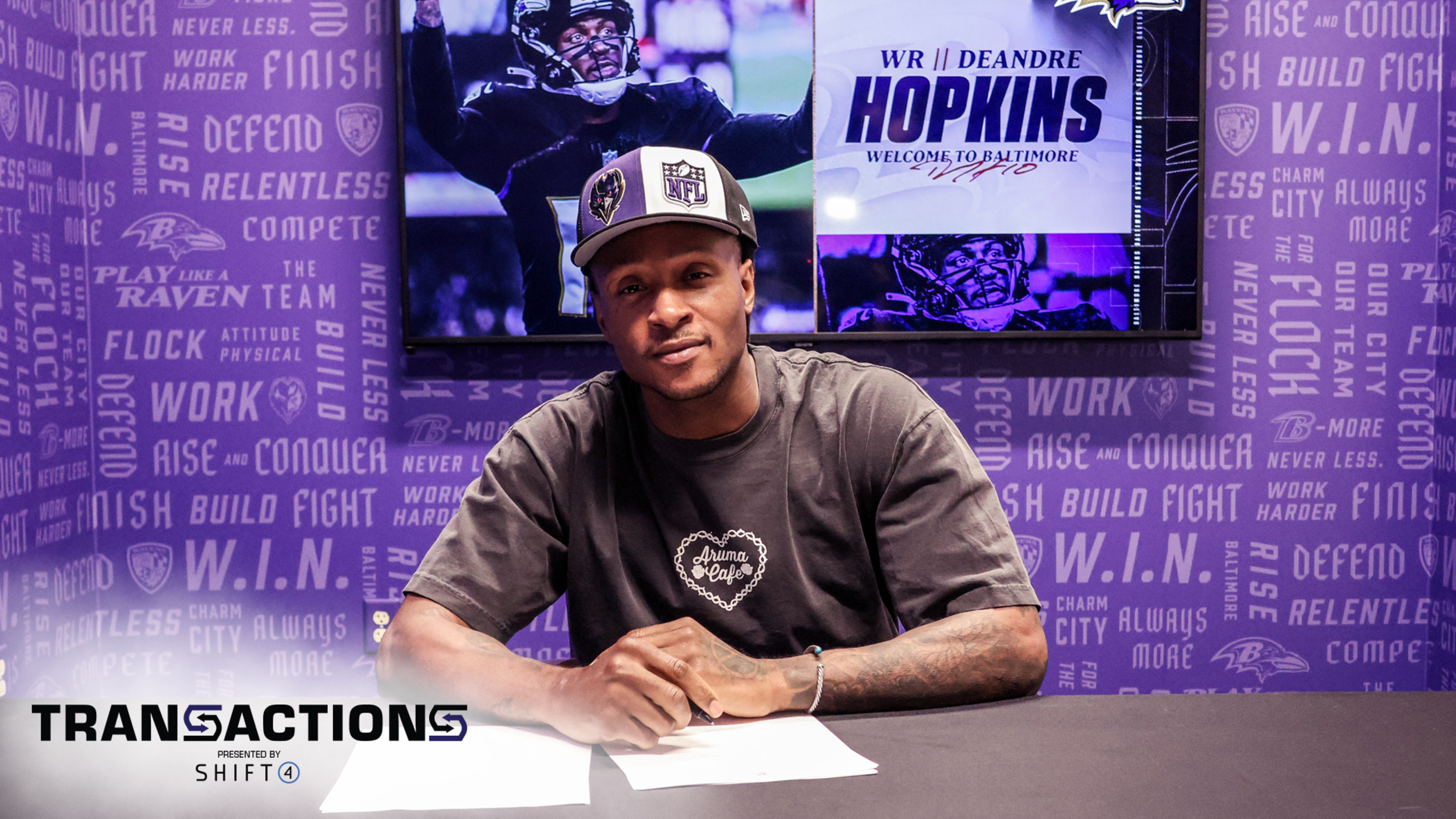
Transactions is a quick article that quickly recaps any Free Agent Signings, Cuts, Trades or Draft Picks.
The Purpose of the Logo was to utilize the negative space in the “S” as arrows dictating players coming or going. The Purple indicates a player coming to Baltimore, while the white/black (depending on photo brightness) is for a player leaving.
Final Approved Logo

Alternate Concepts/Sketches
Article Thumbnail
50 Words or Less
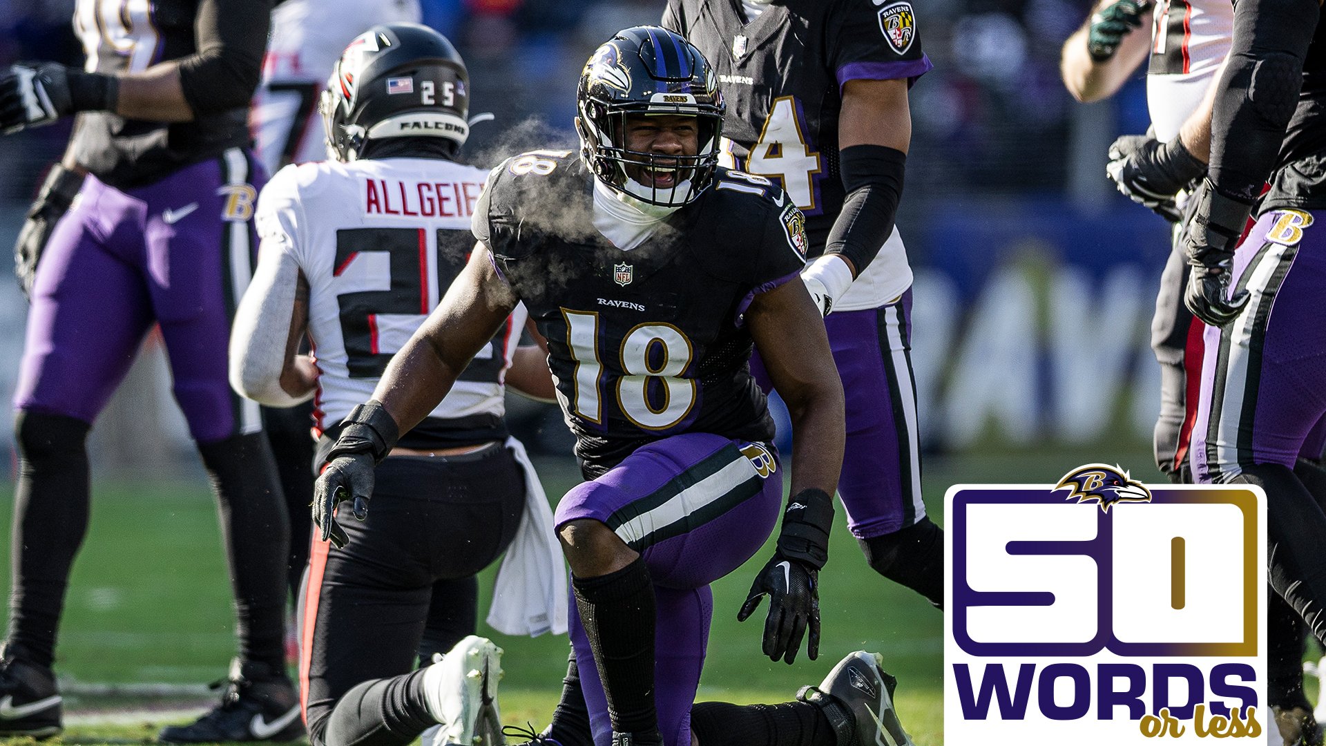
50 Words or less is an article on the Baltimore Ravens website which consists
of a few smaller articles that quickly highlights current news fans should be excited about.
The logo is pretty simple as it is a custom designed 50 while ‘words’ and ‘or less’ are simple legible fonts that let the fan know exactly what they are getting. The shape of the logo is to be used as a tag that looks like it’s coming up from the article’s Headline and description box.
Final Approved Logo
Article Thumbnail
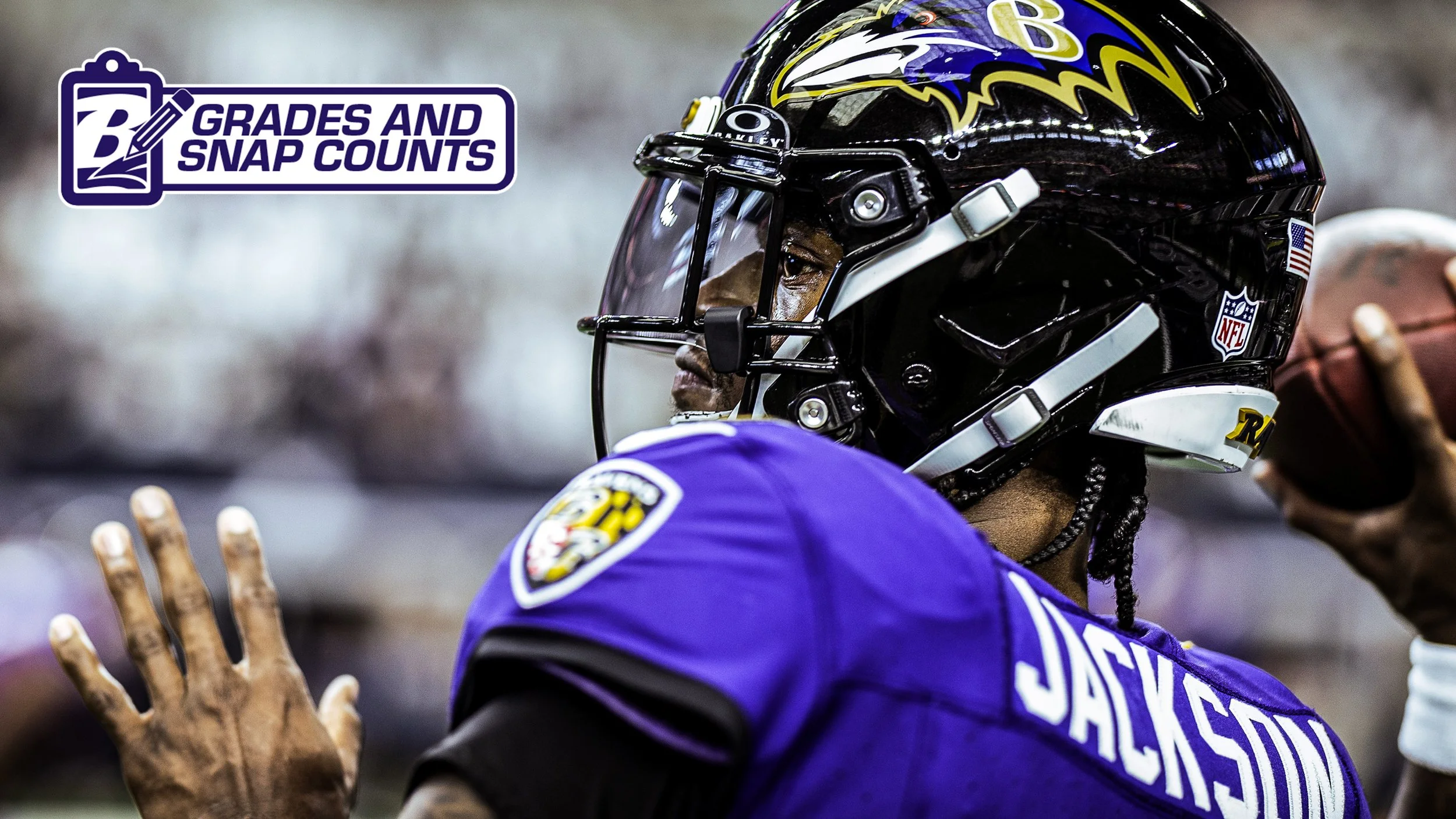
GRADES AND SNAP COUNTS
Transactions is a quick article that quickly recaps any Free Agent Signings, Cuts, Trades or Draft Picks.
The Purpose of the Logo was to utilize the negative space in the “S” as arrows dictating players coming or going. The Purple indicates a player coming to Baltimore, while the white/black (depending on photo brightness) is for a player leaving.
Final Approved Logo
Article Thumbnail
POWER RANKINGS
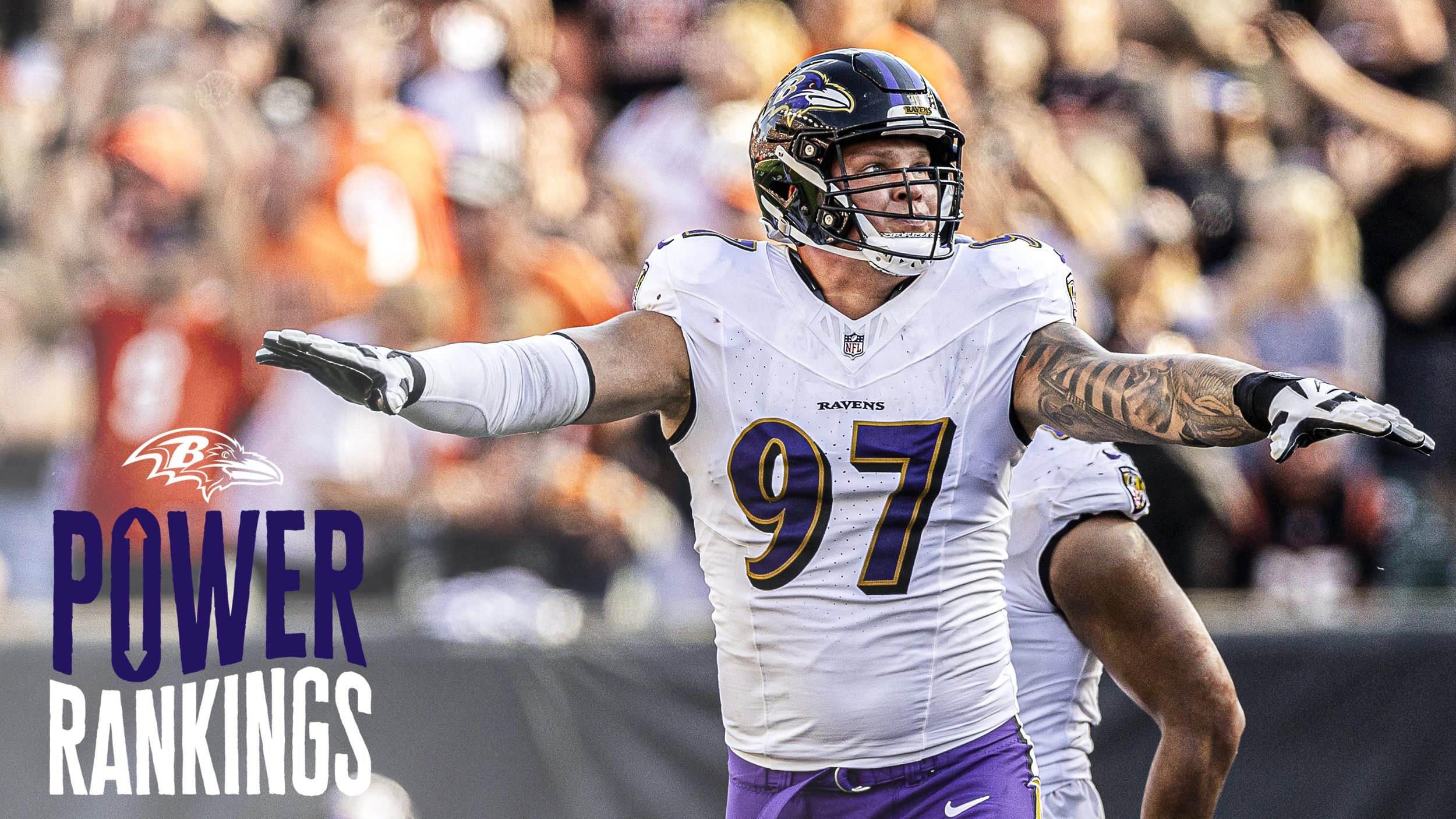
Power Rankings is a weekly article that goes out from Preseason through the Super Bowl. These articles describe which teams are performing the best in the season. The O in power has an Up and Down arrow in the negative space to emphasize the rise and fall of teams. The shape of the wave through the logo also describes this.
Final Approved Logo
Article Thumbnail
25 Days of Giveaways
While not an article, 25 days of giveaways was a social media and website scavenger hunt for the month of December for fans. From December 1 to 25th (Christmas), the Baltimore Ravens gave away signed memorabilia to fans.
Final Approved Logo
Article Thumbnail

Podcast Logos
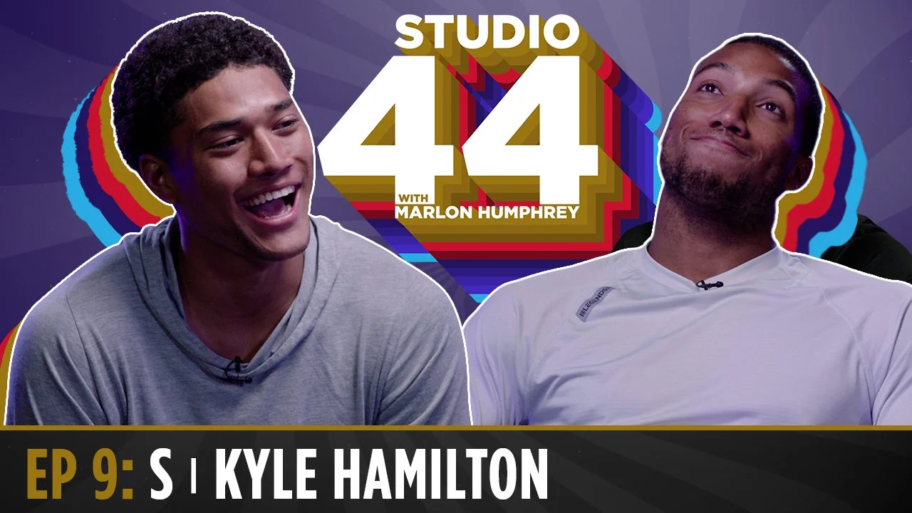
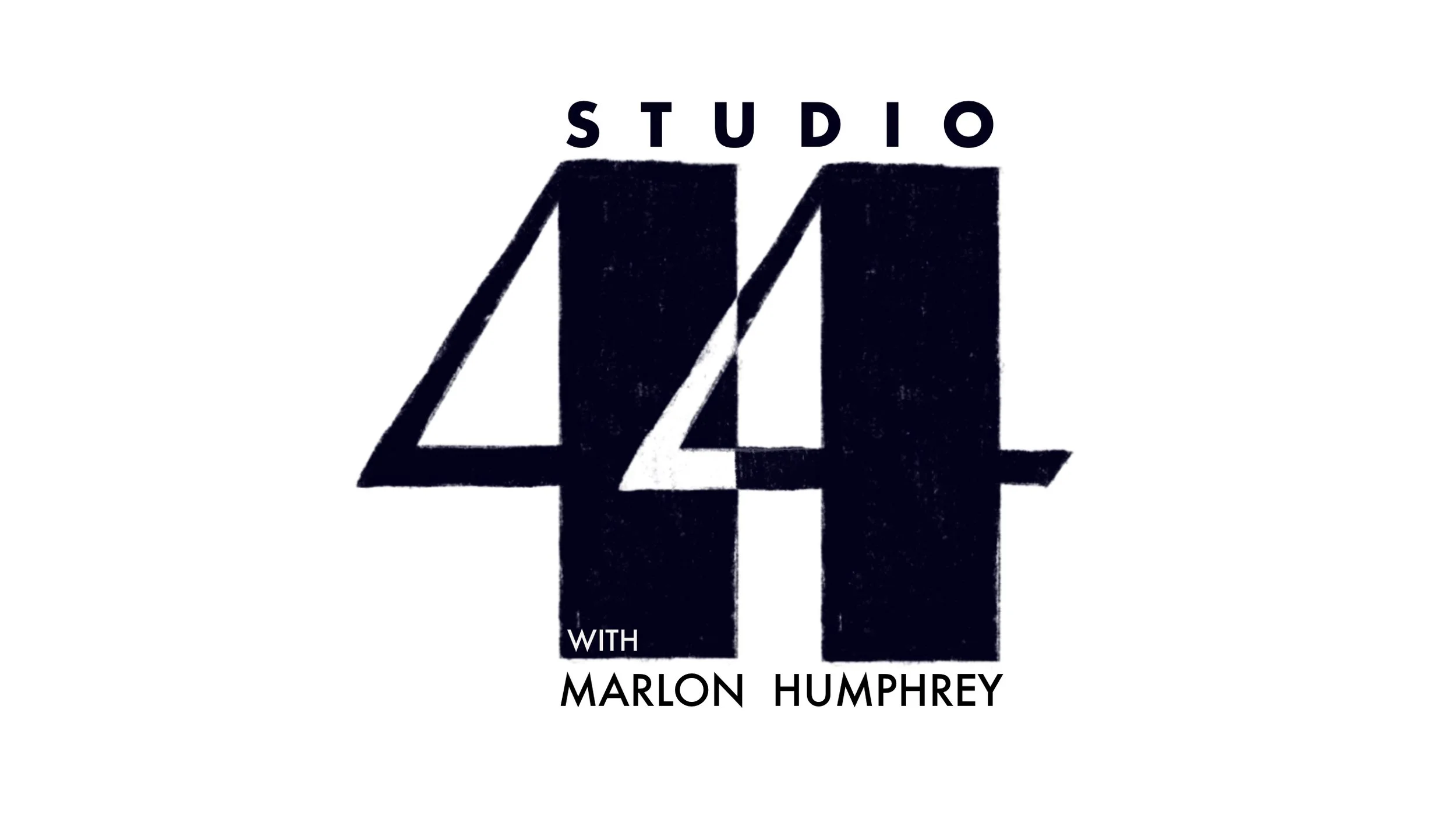
Studio 44
with marlon humphrey
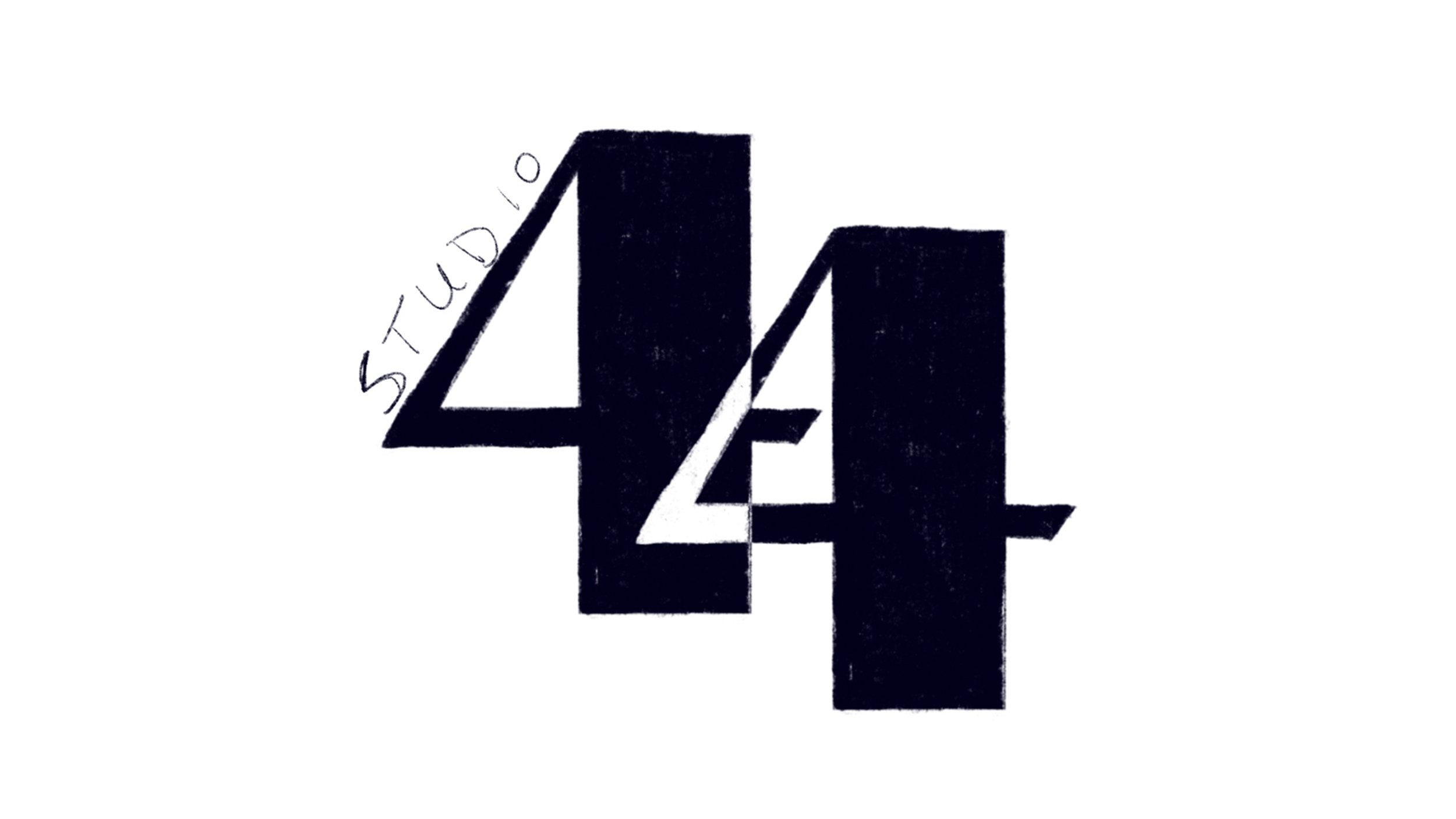
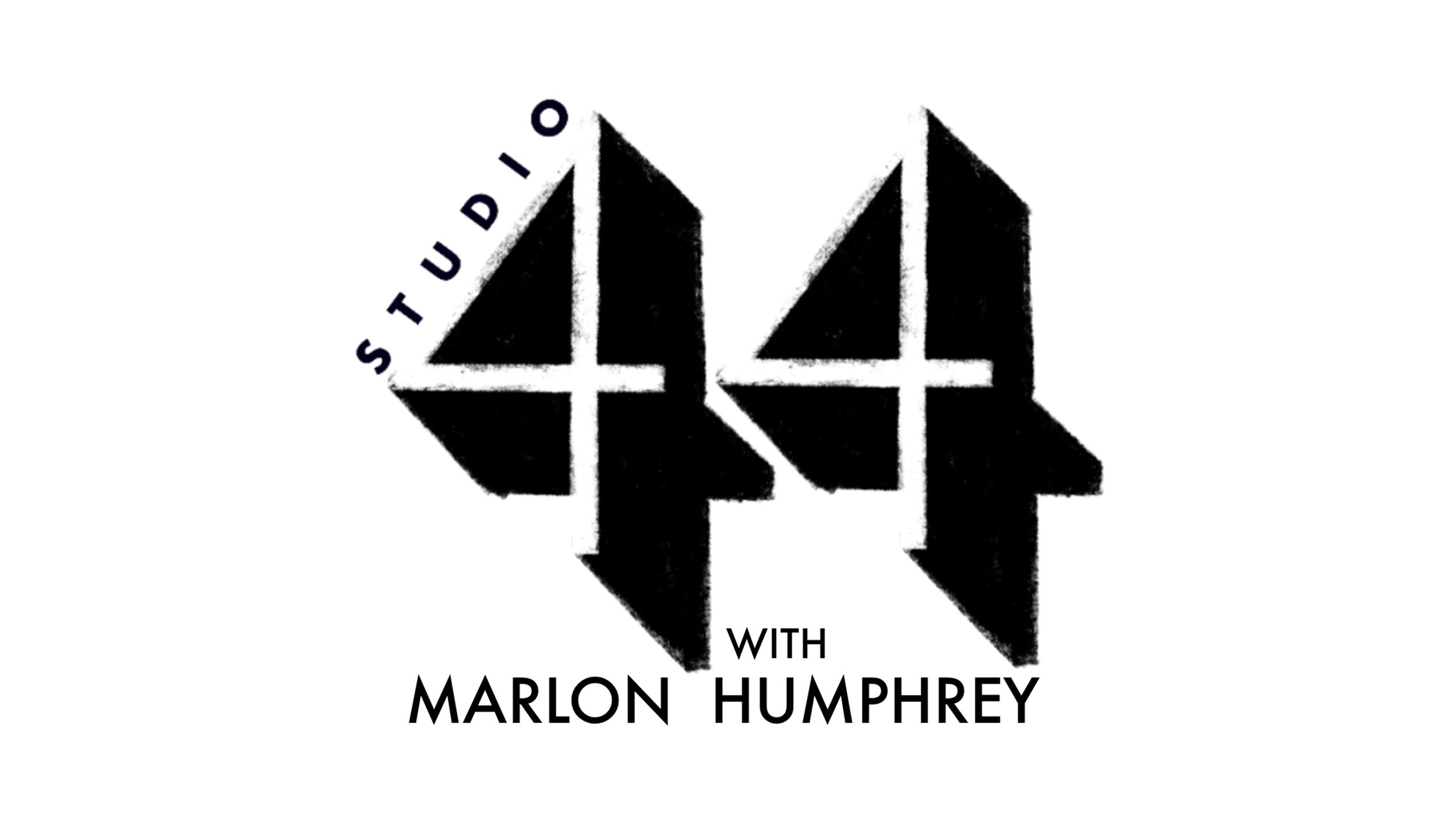
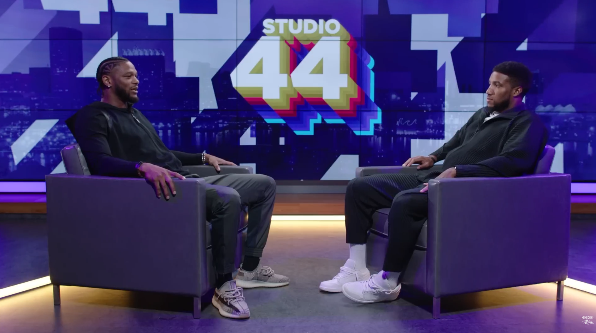
During the 2023 offseason, I met with Marlon Humphrey to discuss ideas for his video podcast he wanted to start. One thing stuck out when chatting with him. He was a big fan of the name Studio 44 based off the famous Studio 54 in New York City.
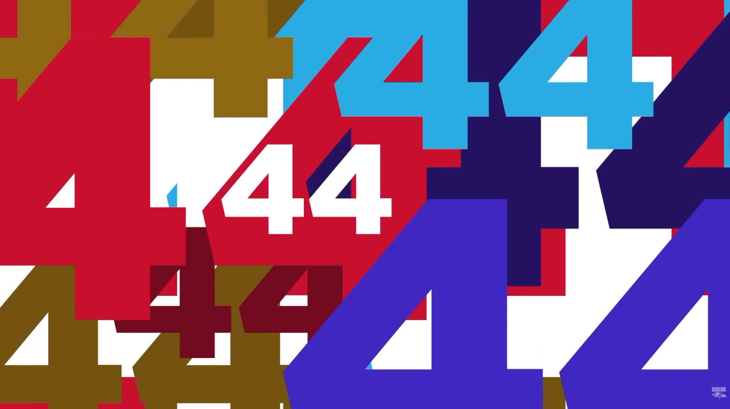
Many logos were based off 70’s inspired design trends, ultimately landing on something with bright psychedelic colors and a repeating pattern.
Final Approved Logo
Alternate Concepts/Sketches
Youtube Thumbnail
B-Roll Studio 44 interstitial
Logo usage as video watermark/lower third
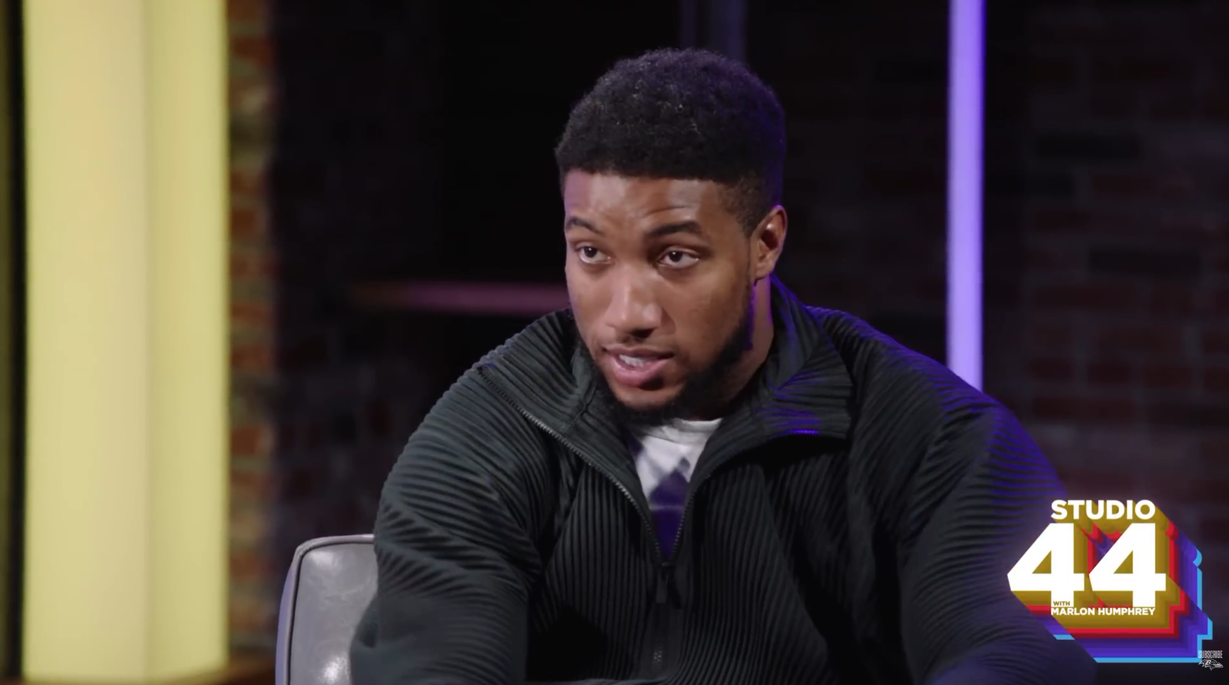
Set design with Studio 44 logo on screen
PRESS PASS
BALTIMORE RAVENS PODCAST NETWORK
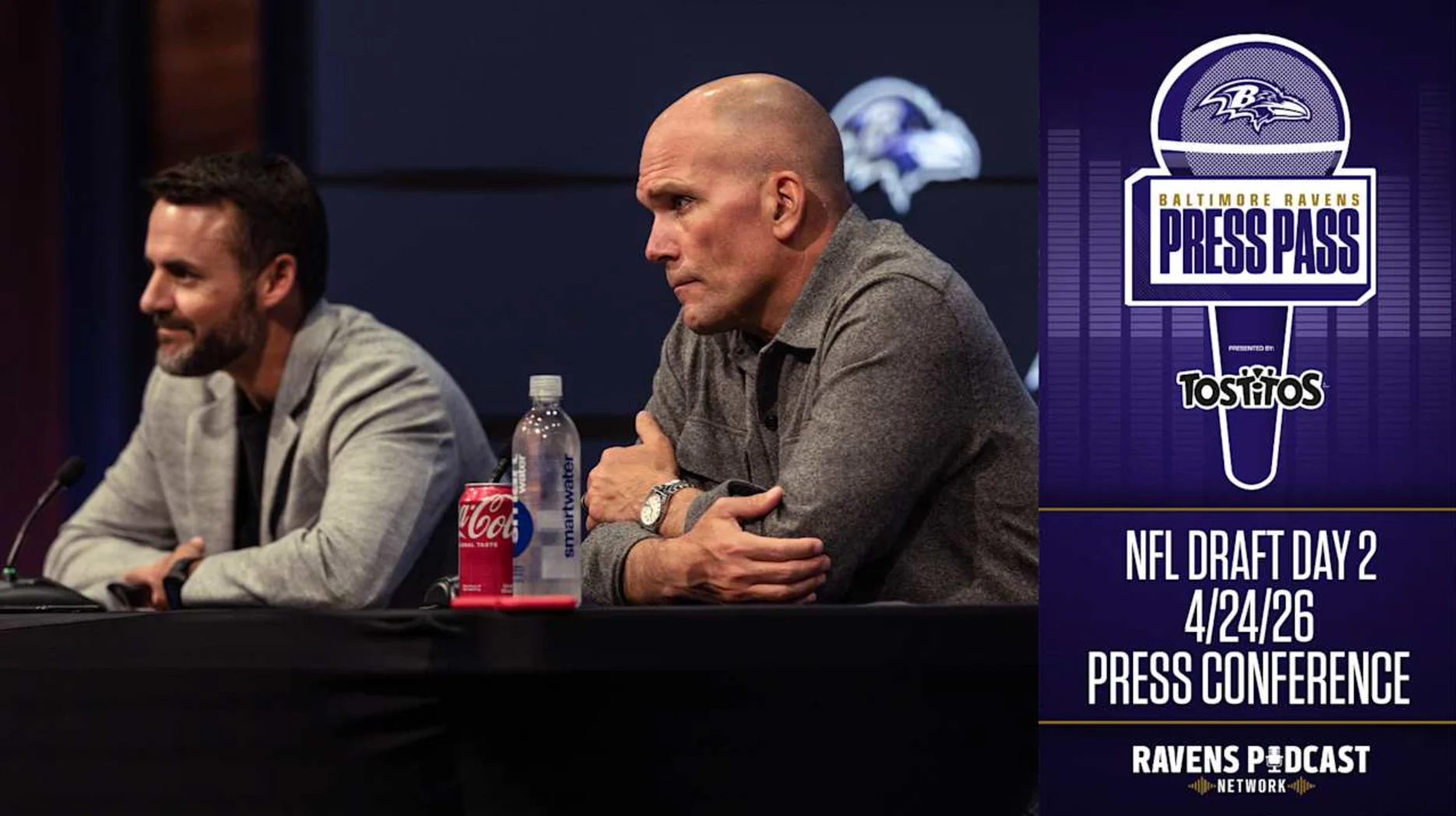
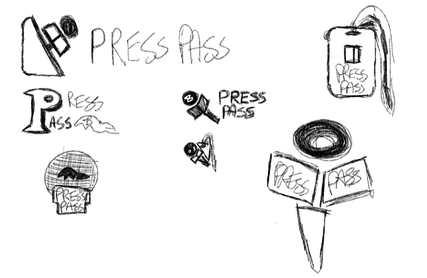
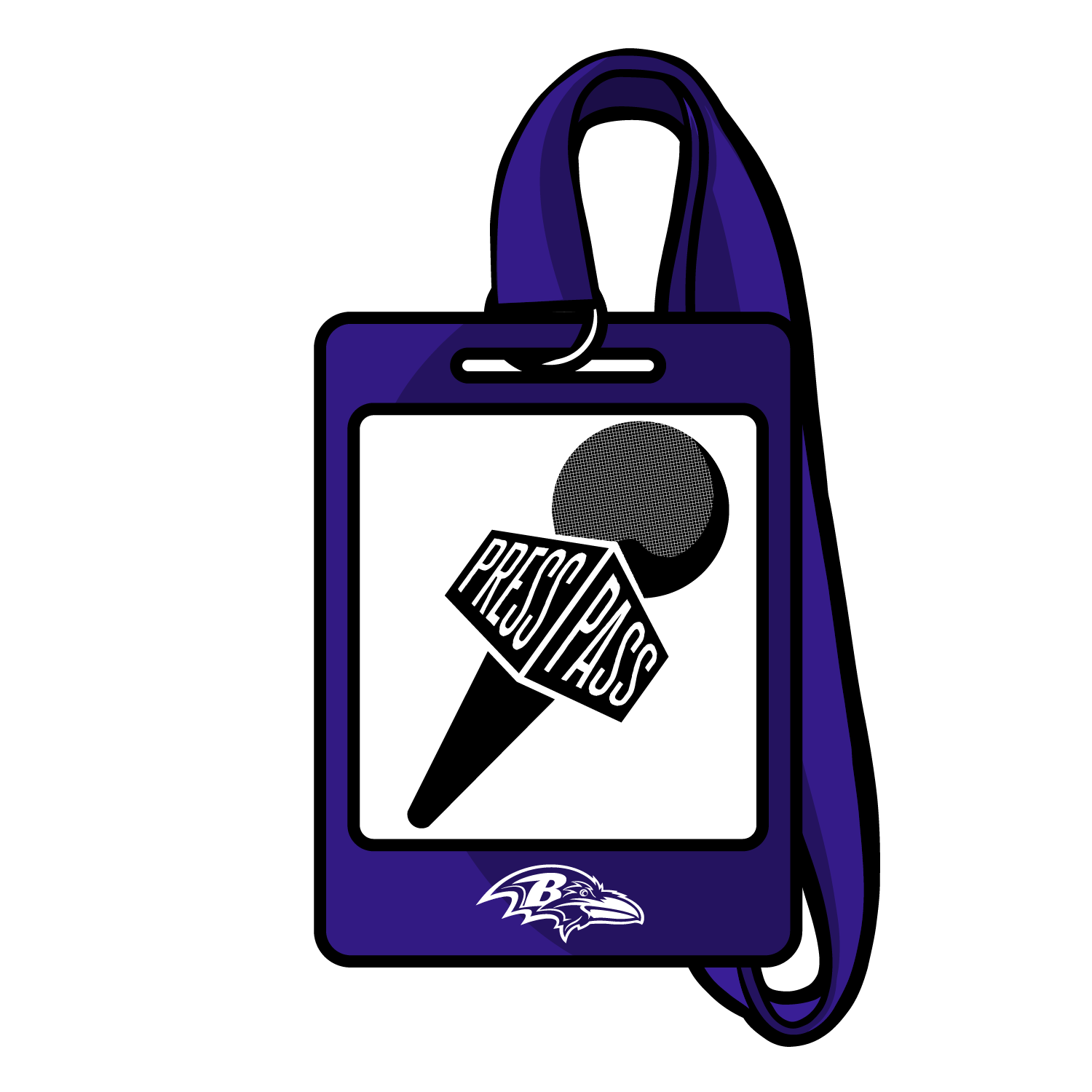
The Baltimore Ravens launched a hub for all their podcasts and video podcasts to live for their fans. This was called the Press Pass, it’s to make the listener feel so close that they are almost like they are part of the Press asking the questions.
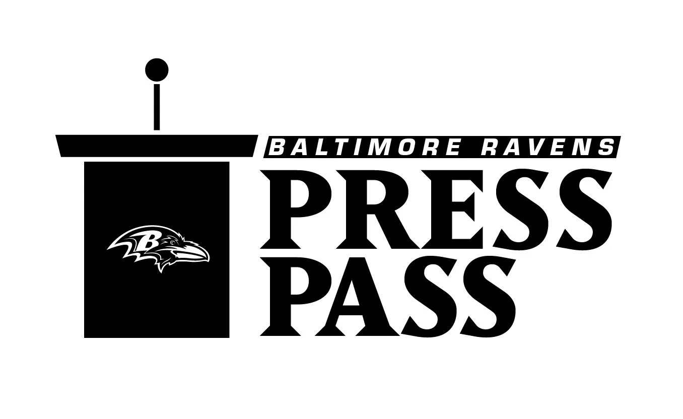
A few logo concepts included a lanyard or podium but ultimately going with a microphone was the chosen concept to pursue.
Final Approved Logo
PODCAST Thumbnail
Alternate Concepts/Sketches
SOCIAL MEDIA VIDEOS
1 on 1 at the castle
LIVE SOCIAL MEDIA INTERVIEW
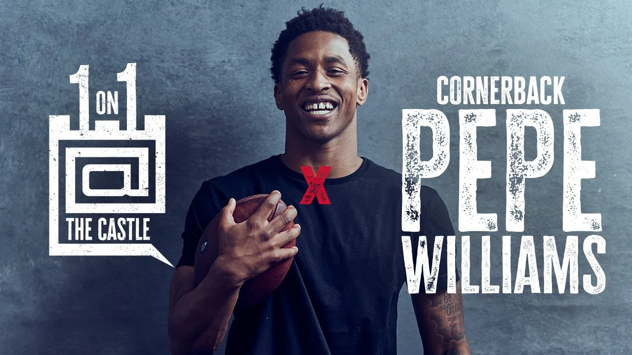
During the 2022 offseason, the Baltimore Ravens social media team launched a live Interview with players where fans could write in comments on Youtube and Instagram that the players would answer. This only lasted one year because it became too difficult to schedule players consistently.
With this being a web and social based show, the Shape of the speech bubble to resemble the comments from fans, an @ symbol to connect it to the fans usernames, while being in a castle shape. The 1’s at the top of the logo are to resemble the flags at the top of the castle.
Final Approved Logo
ThumbnailS
Mandatory MINI CAMP
The Baltimore Ravens launched a hub for all their podcasts and video podcasts to live for their fans. This was called the Press Pass, it’s to make the listener feel so close that they are almost like they are part of the Press asking the questions.
A few logo concepts included a lanyard or podium but ultimately going with a microphone was the chosen concept to pursue.
Final Approved Logo
Thumbnail
Alternate Concepts/Sketches
MINI MIC
SOCIAL MEDIA VIDEOS
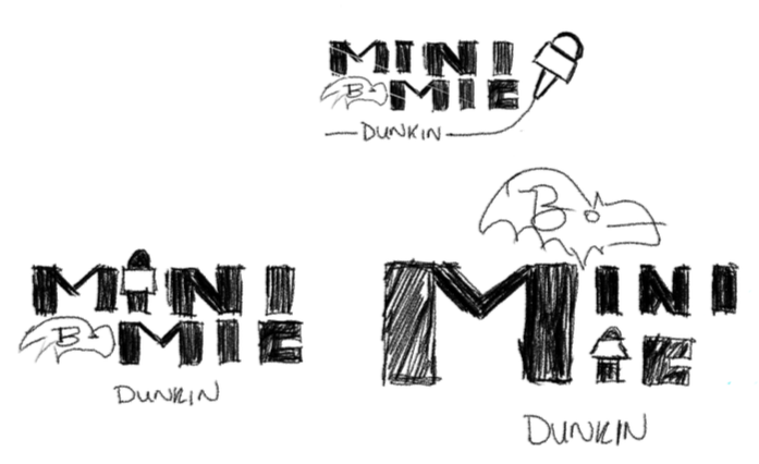
A common social media trend with the rise of TikTok and Instagram Reels, was the addition of a small pocket sized social media microphone for interviews. These funny interviews often pose a very unserious question to get fun reactions.
Final Approved Logo
MINI MIC VIDEO
Concepts/Sketches